Pivot Tables in Excel – Data Analysis made easy!
Here at JPL IT Training Limited we run Excel training most of the time and two of our courses focus as a key element of that wonderful mysterious feature called Pivot Tables and Charts. Pivot Tables and Pivot Charts are great tools within Excel that you can use to make analysing your data easier and more effective that a basic chart. They can make analysis a large spreadsheet of raw data extremely easy! We cover Pivot Tables in a few of our courses with one being our Master Class Excel Bronze training course.
How to create a Pivot Table
You used to be have to be a 9th Dan Ninja expert to even think about using them but now they are available to all simply and quickly. See how below by following these simple steps.
- Ensure your master data has a single row heading at the top and continuous rows of transaction data underneath
- To insert a Pivot Table, make sure you have an active cell selected. Then select the Insert Tab and choose Pivot Table
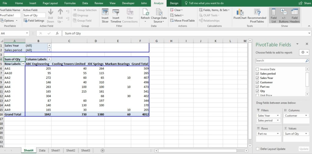
- A new sheet is given looking like below

- The sheet view that you can see above was created by simply dragging and dropping fields on the right hand pane into various quadrants at the bottom right. The resulting Pivot Table is hence created automatically on the left showing in this example a SUM of quantities sold by customer by part with filtering possible on year and period. (You can change the view from SUM to other functions like COUNT, AVERAGE, etc. by double clicking on the ‘SUM of Qty’ cell and changing the function to that you require).
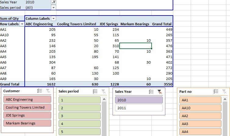
- A new feature in later versions of Excel is the use of slicers. These make filtering so simple. Again see the example below.
For more details on our Excel training courses or if you especially want to learn more about Pivot Tables in Excel, please email us at johnlegge@jplcomputer.co.uk or phone on 07903 840105.
Why not take a look at our previous post on features in Outlook to save you time?


